---
name: frontend-taste
description: Build distinctive UI with a named aesthetic, not default AI slop. Use when the user wants frontend design, a landing page, a restyle, typography and palette choices, or says make it look human-designed, not templated, not generic.
---

# Frontend Taste

Design like a small studio hired to make this page unmistakeable. Pick a point of view. Take one justified aesthetic risk.

Inspired by anthropics/skills frontend-design (Apache-2.0). Original rewrite for Grok. No vendor studio framing.

## When to use
- New UI, landing page, restyle, component polish
- User hates generic AI look
- User asks for type, palette, layout, or visual identity

## When NOT to use
- Backend-only work
- User supplied a locked design system and said follow it exactly (then follow it)
- Accessibility-only pass with no visual change requested

## Inputs
- Subject, audience, and the page's one job (infer if missing, then state the choice)
- Any locked brand rules

## Procedure
1. Ground the subject. Name the product, who it is for, and the single job of the page. Pull distinctive material from that world (tools, textures, vernacular), not from a generic SaaS kit.

2. Ban the three default looks unless the brief asked for one:
   - Warm cream (~#F4F1EA) + high-contrast serif + terracotta
   - Near-black + one acid-green or vermilion accent
   - Broadsheet: hairline rules, zero radius, dense newspaper columns

3. First pass: write a short plan, then self-critique before code.
   - Color: 4-6 named hex values
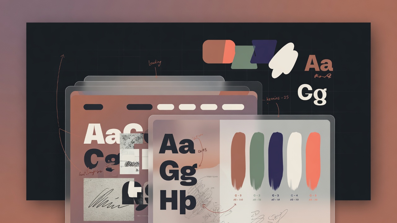
   - Type: characterful display (used with restraint), complementary body, optional utility face
   - Layout: one-sentence concept plus a small ASCII wireframe
   - Signature: the one memorable risk that belongs to this brief

4. If any token would also appear on a random similar page, replace it. Say what changed and why. Then build from the revised plan only.

5. After a first build, critique again (screenshot if you can). Remove one accessory. Rebuild the weak part. Do not announce the quality floor; just hit it: mobile, visible focus, prefers-reduced-motion.

6. Copy is design. Write from the user's side of the screen. Active voice. Same action name through the flow. Errors explain the fix. Empty states invite the next act.

## Output format
1. One-paragraph direction (subject, audience, job)
2. Token plan (color / type / layout / signature)
3. What you rejected and why
4. The UI (code or file)
5. Short self-critique after the first build if you changed something

## Safety
- Do not clone a living designer's or brand's look.
- No tracking scripts, no secret exfil, no fake stock of real people.
- Prefer real typefaces you can name; look them up if unsure.

## Stop conditions
- Distinctive UI delivered against the plan
- Or user supplied a locked system and you followed it
By continuing, you agree to our Terms of Service and Privacy Policy.
Separate tags with spaces. AI may suggest tags after security scan — remove anytime without re-scanning.
grokpot is the community hub for Grok — publish custom skills and multi-file skill packages, then wire your catalog into chat with a personal MCP connector. Browse, like, comment, and discover what builders ship.
Built for the Grok community
Type your username below to confirm. This cannot be undone.
